We are a merge of the past and present - of diasporic identities from all walks of life. We see the beauty, history, time, community, and love has brought us. Together, we build a new world, our world.
Under Our Sky is an ongoing design series examining diasporic Chinese culture ands its inherent influences from overlapping communities in our shared land. Rhythms of patterns and inconsistent nuances are core to our sense of change. Under Our Sky merges traditional patterns, immerses contemporary techniques, and is made in small experimental quantities.
More below.
Eternal
The Town

Village Ends
Continuum

Amour

History

New Rhythms

In-between

Kaiping

Youth

Linger

Winter
Evergreen

Summer
Autumn

Eclipse
Series 3: Overlaying with photography as a means to merge abstracted with captured memory. While immortalized, the overlayed photographed becomes enmeshed and details are lost to the design. The works are read almost as fairytales, memorials, dreamscapes, or one step farther from reality.
Series 2: A love letter to gradients, warm memories, and lingering losses. While expanding on the expressed vocabulary in repeated symbols, Series 2 breaks away from patterns, disrupting the traditional narrative. Pulling from specific locations such as Los Angeles, Kaiping, China, and Chinatown, San Francisco, symbols are not only taken into consideration from functional objects but also, the architectural landscape. A map of locations, of paths once crossed dance together to form new stories. While their roots and pinpointed locations are not specified in the work, its presence impacts the build, as does the places and experiences play into the build of a person’s story, no matter how much or little they can remember the details in throughout their many walks of life.
Knowing History:
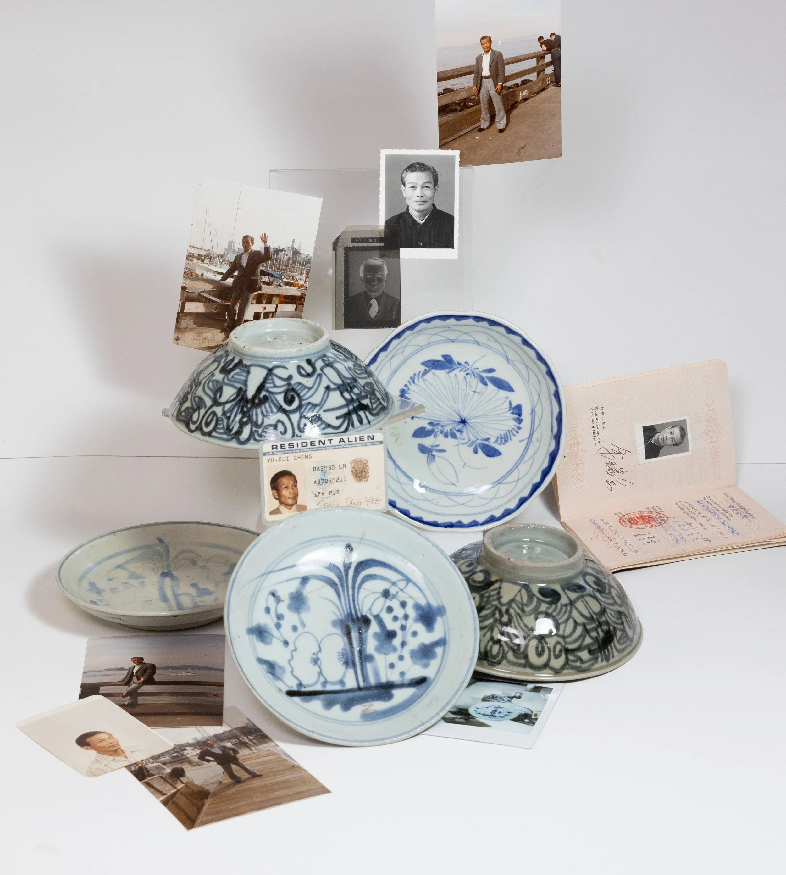
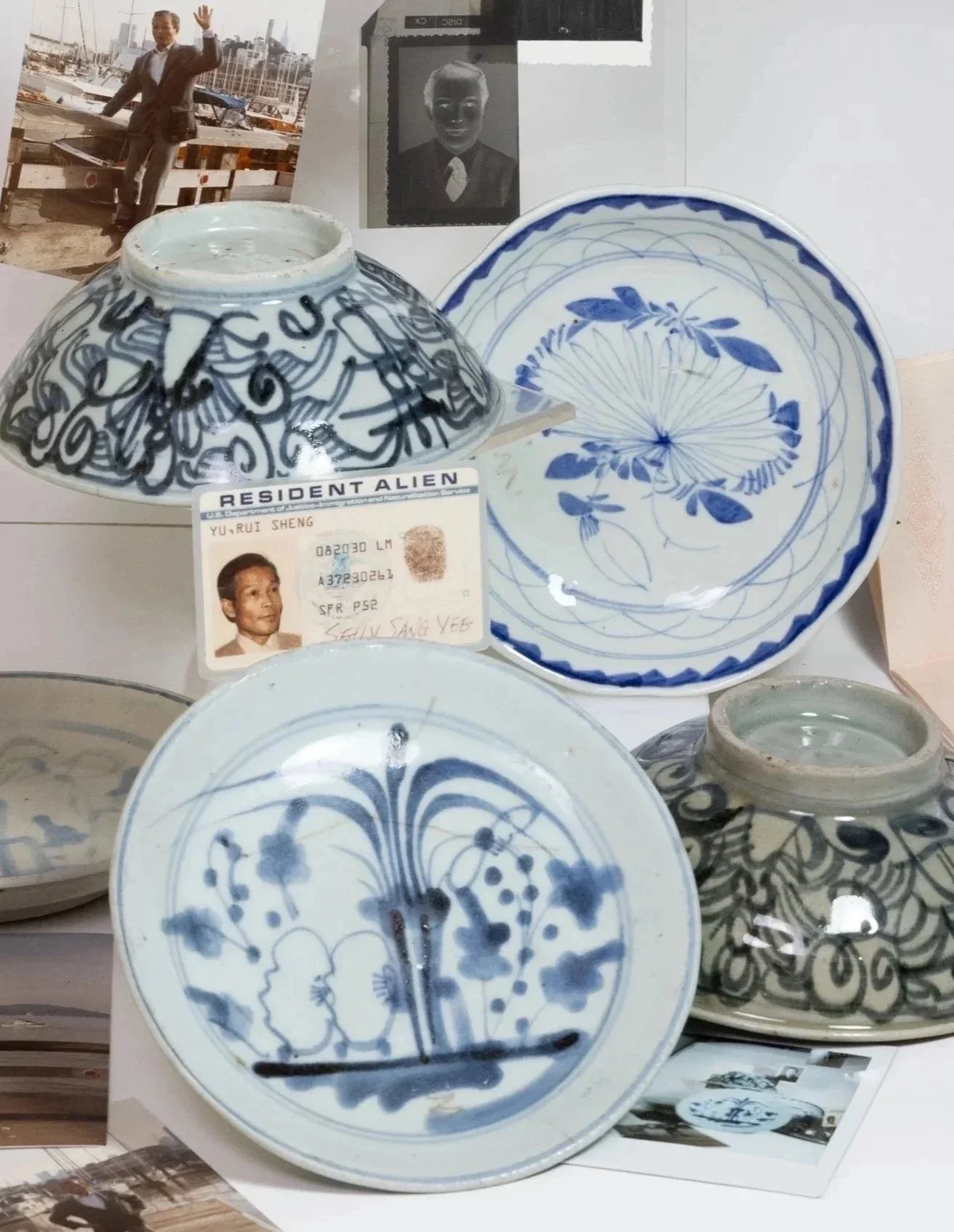
Family Relics, Kitchen Qing, and Peranakan Chinese Ceramics
Ceramics within my family used for ancestral alters, see second photo below, are traced back to the rise of Peranakan Chinese ceramics. The term Peranakan was only coined after 1966 for Chinese immigrants who settled in Southeast Asia (2). Before then, there were other names associated with the immigrated populations. From my research, I estimate that my family's red alter set was made from 1800-1990.
In 2023, I inherited my own set of blue and white ceramics from my long deceased paternal grandfather, whom I never got to meet. How did it happen? From my aunt and uncle’s trip back their hometown, Toisan, Guangdong, China. I was asked what kind of souvenir I wanted. We settled on something handmade, and during the trip, they surprised me with a FaceTime call to show me what they found. A relative was washing my grandfather’s old ceramic plates, all inscribed with a “3,” representing his birth order. Assumed to be new when he bought them, we could estimate their production to be in late 1800’s to early 1900’s. Image on the far right.
Peranakan ceramics hit a boom in worldwide popularity, and with further demand, quality lowered over the decades. This resulted in mass produced “economic wares” from 1750s-1850s. They cloned and printed styles of blue and white, through hand painting and block-printing, combining westerns and oriental motifs. One of the best known ceramic houses for “economic ware” was Kitchen Qing. They mass produced identical ceramic personal sets for the poor, working class, and exported laborers in tine mines, gold mines, labor camps, and more (whom worked in West Australia, California, and South Africa). Some were made with materials closer to stoneware than porcelain. Cobalt used for coloring ranged from blues to purples and black. Overtime, even the designs simplified and became sketchier as demand and production increased. There is no evidence to support that these blue and white ceramics were used solely for alters, but were rather more commonly used for regular meals (1).
Another movement of blue and white porcelain is Shanghai ware. Shanghai ware’s quality was higher than Kitchen Qing’s, and was used daily as tableware and ancestral alters. I believe there are characteristic differences in design and shape, but I have yet to do the extensive research to reach conclusion (1).
1) Ming-Yuet, Kee, and Lim Hock Seng. Peranakan Chinese Porcelain : Vibrant Festive Ware of the Straits Chinese. New York, Tuttle Pub., 2012, www.everand.com/read/358360468/Peranakan-Chinese-Porcelain-Vibrant-Festive-Ware-of-the-Straits-Chinese. Accessed 2025.
2) Azlin Abdul Karim, Nur. “Cover Story: Investing in Peranakan Ceramics.” The Edge Malaysia, 31 May 2017, theedgemalaysia.com/article/cover-story-investing-peranakan-ceramics. Accessed 14 Nov. 2025.

Image linked to Australian government auction of ceramic ware

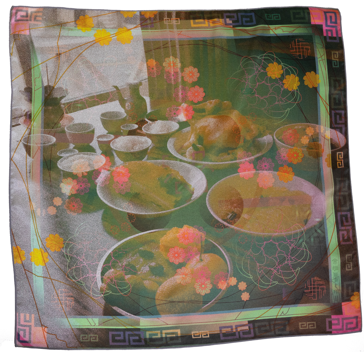
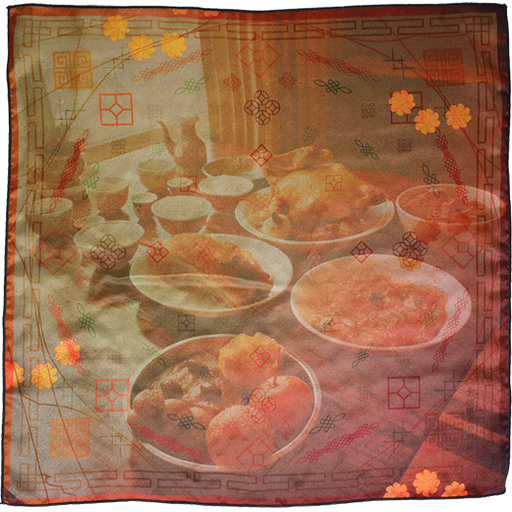
Photo of unsaturated experimental print of Summer with family’s ancestral alter set, a Peranakan red bowl with teapot and cups .
from finding this research and new knowledge, I felt a feeling I never had before. A mixed feeling of pride, joy, wonder, and belonging to land and a lineage of people and history within the larger world. It’s heart warming, mind expanding.
Building and Dreaming Bigger:
Asian Art Museum of San Francisco and Under Our Sky Gateway


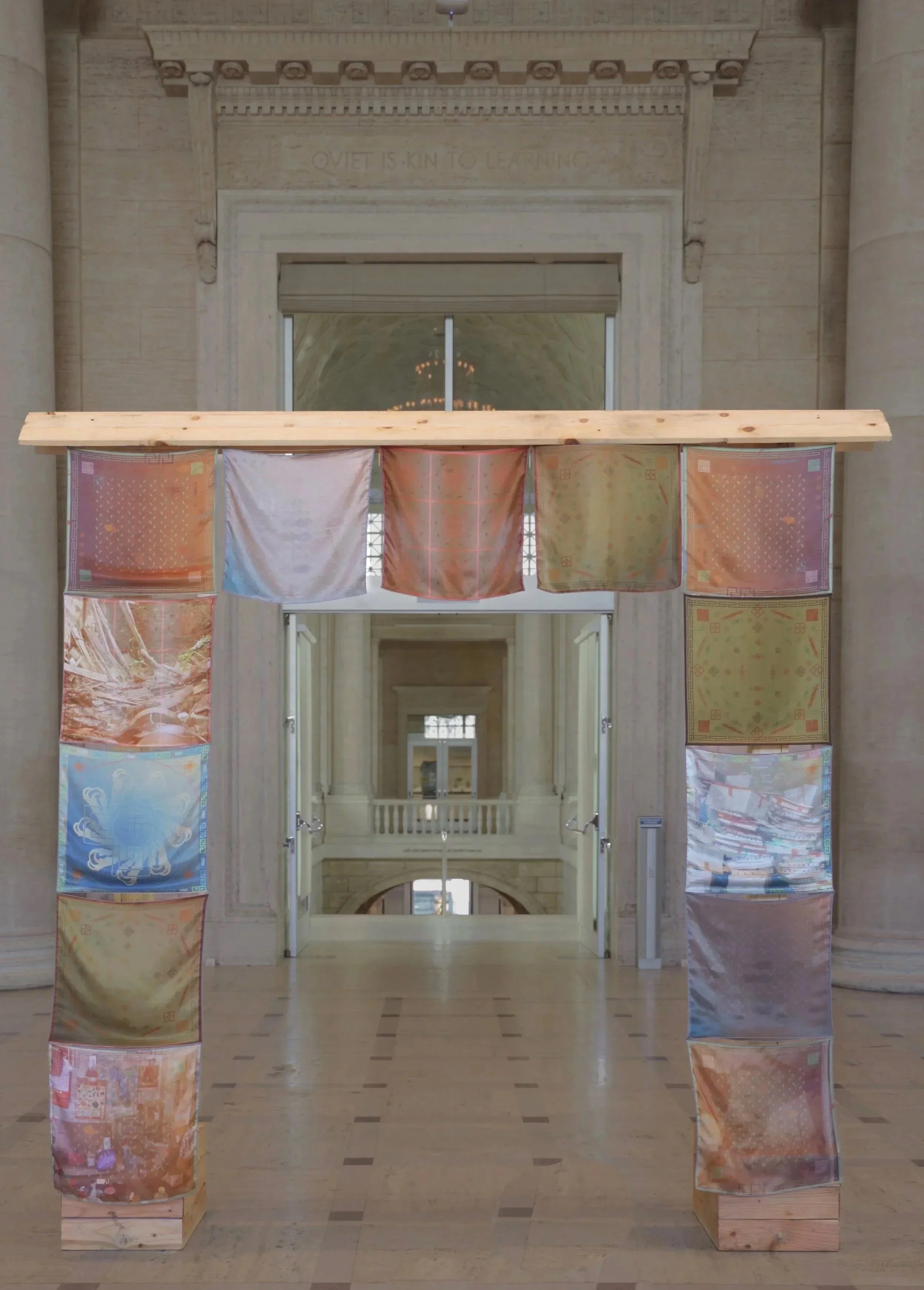
In March 2025, I was approached to be a part of Dream State’s second show at Asian Art Museum in San Francisco. The opportunity allowed for the display of Under Our Sky in the arrangement of a gateway. Drawing inspiration from Chinese gates across chinatowns across the diaspora, varied designs hung across and down the bare wooden frame.
Under Our Sky is made up of patterns from my ancestors’ land, and the diasporic chinatowns I grew up visiting for groceries, and later, feeling a sense of comfort - the kind only grandma’s could give you, and the kind of comfort that only felt more nourishing as time brewed. A sense of belong, community, and connection can be easily seen in its warm tones and repeating elements. Much like the gates to chinatown, each piece is meant to be shared and welcome others in. For the love I have for my homes, I open my arms to you, and may you feel what has nurtured me. Delicate silk threads weave together to create these realities. Extracting my love for color in the everyday and the attention to details and patterns in my community, Under Our Sky is a blanketing highlight, sharing nuances in our communities and intersecting identities. As a gate, it welcomes you towards my world. And allows you to leave at will.
For the gate, I created new editions, overlaying photographs with pre-existing designs. Textile patterns now intertwine with captured images. Together, they become distorted portals to imagined worlds. They are alters to, and altered visions of the past, windows to home, and time frames to a mind.
A different color variation for a new perspective to the story: a warm memory grown cold. With time, age, and change, our lens of the past or our relations may waver as well.
In the photographic overlays, the images become the emotional context for their abstract and graphic counterparts. The photo is a new layer, new information to what has been known. From the information of color, patterns, and shapes to a completely new form of communication: photography. This is where internal expressions meet the physical world, or at least what a set of eyes have captured.
On the surface, the photos are pleasant and kind to the eyes. With context, you will then uncover another story. One of ruins, cluttered homes, and aestheticized landfill. They are moments I found worth capturing during my trip back to China. I find grandparents still living in the village, with towering items just like my grandparents’ room back in San Francisco. I notice what they hold onto: containers, a photo of Mao, calendars printed just like the ones I have back at home, a white wall covered in markings. I find an empty lot with discarded wood, plants growing in between the gaps, and kittens crawling around. Im in a world that feels like it’s mine, and not completely not. I get to be apart of my grandparents past, and the history that have collected in their rooms. Their neighbors are home. The same walls my mother ran past are still there. I am running past them now with my young cousins. Their giggles fill the alleys. My explorative eyes lead me to new rooms, welcoming arms, and a new door with a deepened sense of family. Photos of my great-grandparents are on display in the living room. I learn more about my family there than I would have back in the States. Something about being back where they grew up opened their vulnerability and memories to our history. You must know, they just dont share stories out of the blue. They’re more reserved about the past. It’s as if
Series 2


Personal notes on production results on Series Two and their experimental counterparts:
I am so satisfied with the hues, composition, and values produced. In certain parts of certain gradients, there are visible lines dictating the end and beginning of one color to the next. It can only been caught by the eye under close inspection and with a high ability to detect such differences in coloring. I am reminded of color tests where a set of colors are provided and the surveyor is instructed to determine which color is not the same as the others. Tests like so have been traditionally provided in color blindness tests, or fun brain games in various forms, more popularly through means of short form content and filters that allow you to play and record your reactions to such tests.
Series Two is captures my connection to my heritage, and my personal power in claiming belonging in such spaces through color and patterns. My knowledge of the Chinese arts perspective is one that is still very traditional and saturated in craftsmanship. The arts and cultural traditions are intertwined in a dance that can been uniformly from furniture to textiles, and even cultural customs. Color plays a monumental role in culture. The superstition runs deep! Certain colors for certain holidays, and if that rule is not followed, bad luck (a generalized term here because I lack the knowledge to know more. the badness is more particular depending on whatever superstitious factors are at play) will follow.

Kaiping

In-between

New Rhythms
Series Two is currently in production. The design process began in Kaiping, Guangdong, China when I visited my mother’s hometown in September - October 2024. My first visit was in 2003/4 in the heat of the July sun, we fed the caged chicken rice grains before it was quietly slaughtered for dinner. Some days, I was left playing pretend with my cousin. And on other nights, I found myself holding tightly onto my mother’s waist, watching the streetlights fly by and the wind comb through my skin as my uncle revved his motorcycle cross town.
Now I have a new collection of memories. This time I had the capacity to imagine my mother’s childhood here, and recognize how connected my grandparents are to the people. Cousins and cousins. Beyond the stories of climbing onto guava trees, eating fruit until she learned how the seeds would lead to constipation. Village celebrations of 200 people. Completely melting in admiration of steamed buns whilst carrying my fully belly. Its texture was better than anything I had before: so soft and delicate, yet holding its smooth, glossy, round shape. A subtle, sweet, grassy taste complimenting its steaming surface and chewy, soft texture. There was even a whole building dedicated to the Huang lineage - I wonder if my grandfather’s name is engraved there.
Kaiping is dedicated to the city itself, and its main pattern is inspired by the plastic red fruit boxes carrying the cases of rambutan. We had taken many trips back after my grandfather’s sister-in-law brought us our first pack from the fruit warehouse. The best rambutan, ever. It was almost magic how perfect they all were, snuggled against each other while wrapped in newspaper. Once we found out about the fruit warehouse, there was no going back. Every morning, mom and I would remind each other about the cold shiny rambutans sitting in the fridge for us. We’d dart up with that sparkle in our eyes and only one agenda: rambutan. Of course it is always mom who would ”overdo” things when she really liked something. Her parents would gasp at the amount of cases she bought, making remarks on how absurd this all was, unfathomable to how she could possibly consume it all before the end of our stay. From the rich redness of rambutan skin to the gentle pink lines of her youth, I felt so fortunate to have know what food tastes like in her hometown and to revisit her yesterdays, together in today.
In-between takes a new direction and breaks away from the patterns used from past designs. There is no center cyclic pattern. Instead, a knot repeats to create a cross-hatching like texture. Elements of pattern repeat in small stampedes amongst themselves rather than along the whole design. Some motifs are alone. Some elements interact and bleed off the border. All the while, the foundation remains: a solid color border, an internal bordering pattern, and repeating corner elements. New organic shapes and line can also be found here: from decor metal gates to ellipses. The sense of movement created from the one-off elements, breaking off the border, and tilled positions suggests a searching or scrappy collaged element. For the first time, elements can be found blurred, disappearing into the background. In-between is a mix of yesterday and today, of old and new, of our pasts and our todays. Even the soft lavender and creme orange background alludes to the setting of a sun, or the dawn to a new day. A place for things to be forgotten, and new patterns to bear a home.
New Rhythms was the first of the three to be conceptualized. A trip to Los Angeles in December 2024, inspired a new element began to appear, and allowed for the design to come to its completion. Pulling patterns from Kaiping, metal gates from San Francisco, and Glendale. Alex and I made our way exploring farms, museums, and Christmas decorations at night. I witnessed a new year’s kiss from a stranger, a phallic rock collection, and a house of intergenerational artists.
Series One: Around the Sun
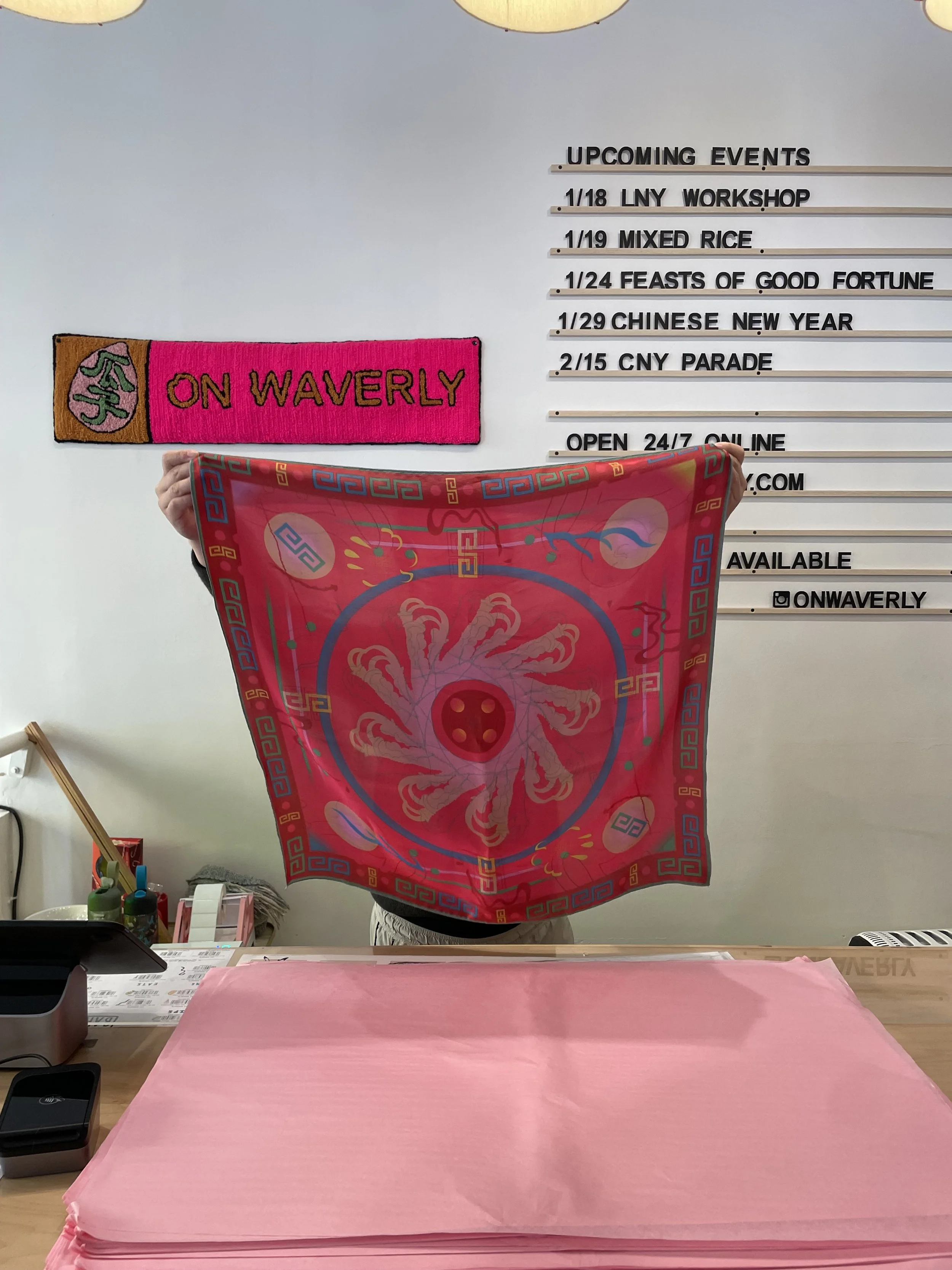
As of November 2024, three of our designs have been produced in a limited batch of 18, in stores at On Waverly in Chinatown, San Francisco, CA.
I am very proud to have my work in a place like On Waverly. Big thanks to Jenn, Ava, and the On Waverly team!

Winter
Left: Photographed by Ava Lynch, January 2025
Summer
Evergreen


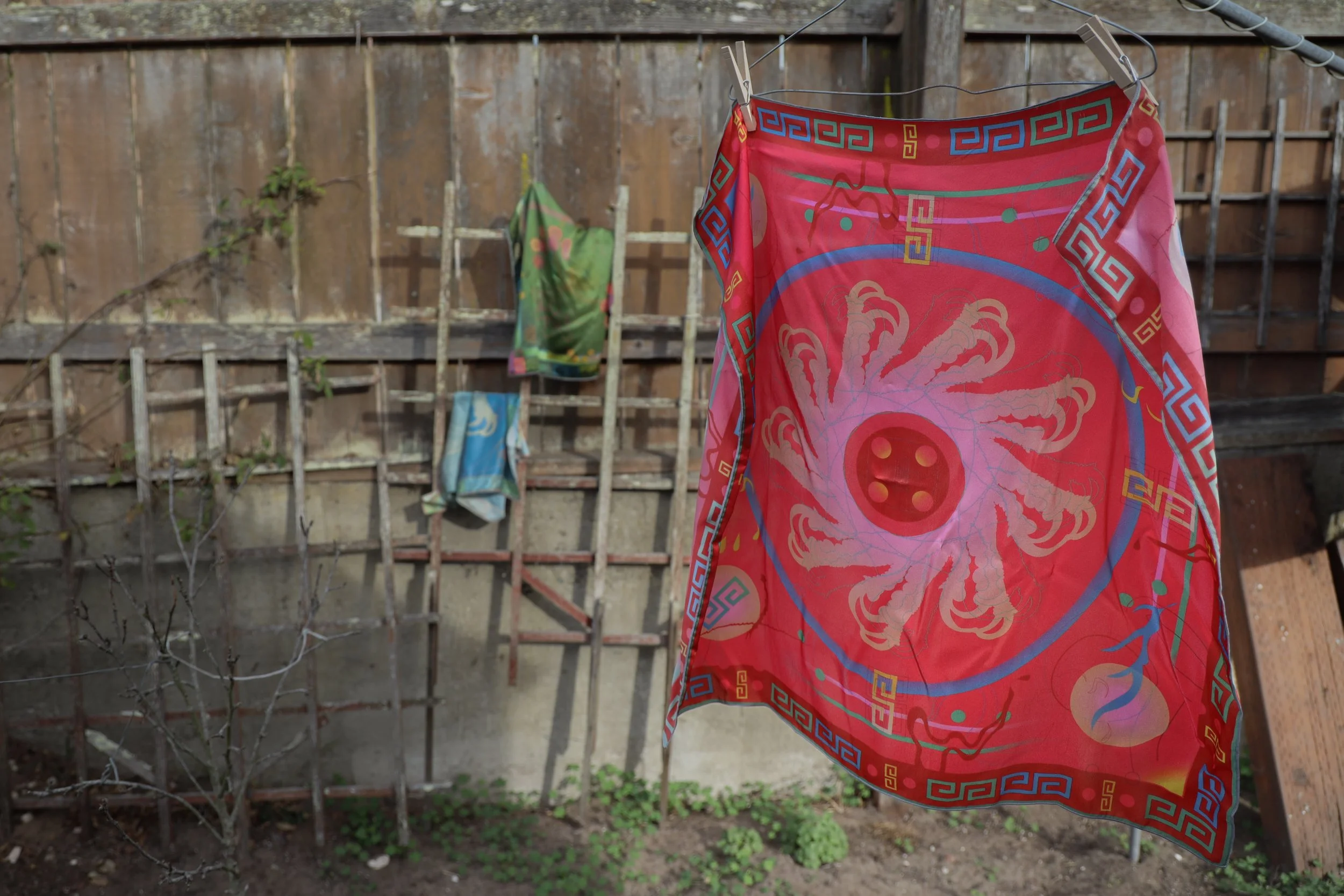


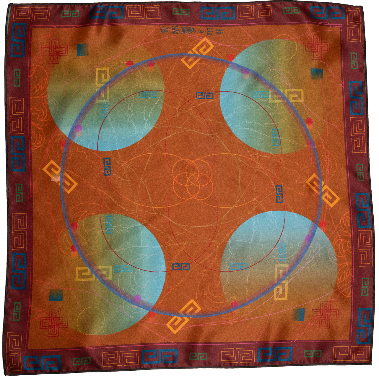
Series 1: Under Our Sky began through exploring the nature’s connection to Earth’s positioning: seasons, solar eclipses, and evergreen species. Juxtaposing nature’s cycles and adaptations with generationally preserved patterns from Chinese patterns and symbols serves to emphasize the resilience the people have placed in continuing to recall their ancestral legacies. While Summer (red) takes many shapes from my previous works, all works within Series 1 utilizes two main motifs: chicken feet and s-shaped geometric figure.

In January 2025, Yà Cult and Chris partnered together, utilizing tooth jewelry designs seen in their first collection to create a limited print of 6 silk prints.
How it began: On a sunny day, hunched over a laptop in the middle of an airport. The kind of day that made your skin warm and cozy. I was knees deep tinkering on Illustrator, fumbling with bold red colors and patterns of home. My legs were happily sore from my first trip, of many to come, to New York. I craved to wear a bandana that felt like home as my new buzzcut was growing longer, taking new forms. Toying with the old ceramics set my family used on holiday alters for our ancestors, I began a new conversation of tradition, homage, and identity. A similar color and patterned border encompasses the design. Talons rotate in the center, from white chicken feet. Organic lines rotating along the design refer to a former illustration, Displacement (2020). The making of this series launches my body back in time, to a quiet and dim unfurnished basement, where my gravitation towards rich glitters and harmonious colors fueled my serene mind and relaxed body.

Vintage Chinese Mun Shou Serving Bowl 1960’s Red Enamel Porcelain Bowl Chinese Longevity Pattern Bowl Large Size PC3243

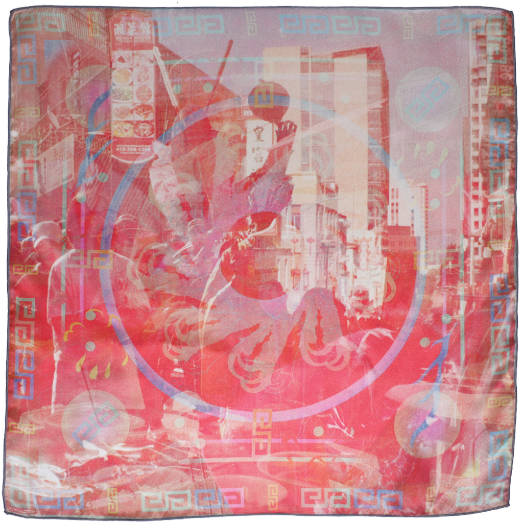
Corner of Summer Talons silk print
Photo of unsaturated experimental print of Summer Talons with still life of personal heirloom set.